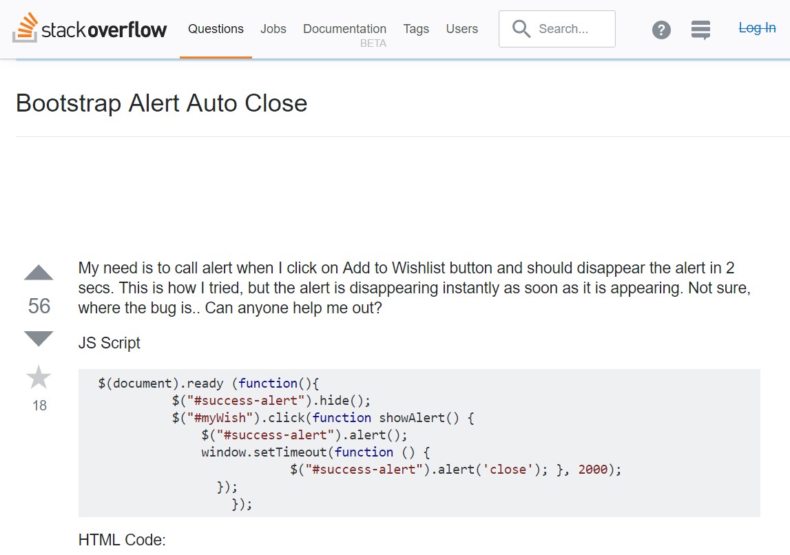
Bootstrap Alert Styles
Introduction
The alerts are created by these components you even don't think about till you actually get to really need them. They are used for giving prompt in time responses for the user having interaction with the website hopefully aiming his or hers attention to a specific course or evoking specific actions.
The alerts are most often used along with forms to give the user a recommendation if a area has been filled in inaccurately, which is the right format expected or which is the status of the submission just once the submit button has been pressed.
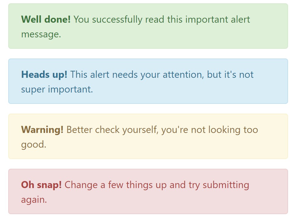
As most of the elements in the Bootstrap framework the alerts also do have a well-kept predefined appearance and semantic classes that may possibly be used according the particular case where the Bootstrap Alert has been presented on display. As it's an alert notice it's important to take user's interest but after all leave him in the zone of comfort nevertheless it might even be an error notification. ( click this link)
This gets accomplished by use of delicate pastel colors each being intuitively been connected to the semantic of the message information like green for Success, Light Blue for regular info, Pale yellow seeking for user's interest and Mild red revealing there is in fact something wrong.
<div class="alert alert-success" role="alert">
  <strong>Well done!</strong> You successfully read this important alert message.
</div>
<div class="alert alert-info" role="alert">
  <strong>Heads up!</strong> This alert needs your attention, but it's not super important.
</div>
<div class="alert alert-warning" role="alert">
  <strong>Warning!</strong> Better check yourself, you're not looking too good.
</div>
<div class="alert alert-danger" role="alert">
  <strong>Oh snap!</strong> Change a few things up and try submitting again.
</div>
Color option of the link
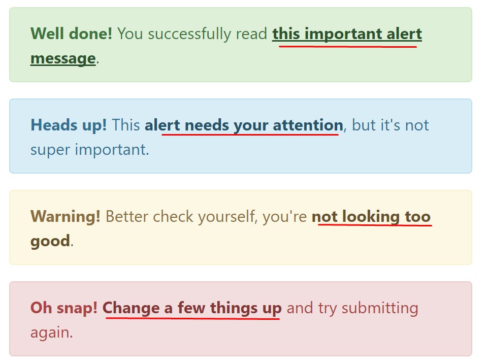
This might not be spotted at a look but the font color also is in fact following this coloration as well-- just the colors are much much darker so get intuitively takened as dark however it's not exactly so.
Same goes not only for the alert text message itself but as well for the web links included in it-- there are link classes getting rid of the outline and coloring the anchor elements in the proper color tone so they suit the overall alert text look.
<div class="alert alert-success" role="alert">
  <strong>Well done!</strong> You successfully read <a href="#" class="alert-link">this important alert message</a>.
</div>
<div class="alert alert-info" role="alert">
  <strong>Heads up!</strong> This <a href="#" class="alert-link">alert needs your attention</a>, but it's not super important.
</div>
<div class="alert alert-warning" role="alert">
  <strong>Warning!</strong> Better check yourself, you're <a href="#" class="alert-link">not looking too good</a>.
</div>
<div class="alert alert-danger" role="alert">
  <strong>Oh snap!</strong> <a href="#" class="alert-link">Change a few things up</a> and try submitting again.
</div>
Other relevant information for alerts
A thing to indicate-- the color options bring their clear interpretation only for those who actually get to check out them. So it's a good idea to as well be sure the detectable content itself carries the meaning of the alert well enough or to eventually add a number of extra explanations to only be seen by screen readers if you want to offer the page's accessibility .
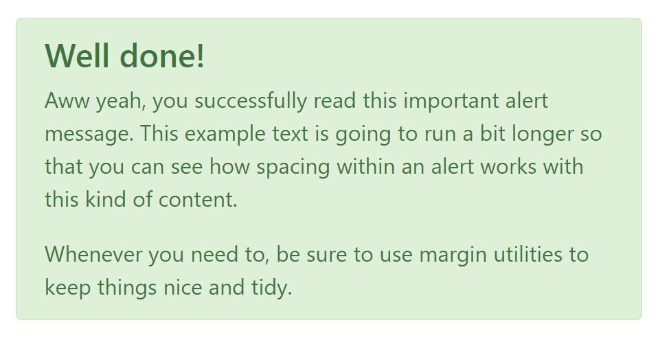
With links and simple HTML tags like strong as an example the alert elements in Bootstrap 4 can also have Headings and paragraphs for the situations when you need to present a bit longer information ( visit this link).
<div class="alert alert-success" role="alert">
  <h4 class="alert-heading">Well done!</h4>
  <p>Aww yeah, you successfully read this important alert message. This example text is going to run a bit longer so that you can see how spacing within an alert works with this kind of content.</p>
  <p class="mb-0">Whenever you need to, be sure to use margin utilities to keep things nice and tidy.</p>
</div>
Reject the alert
Once more ensure the visual comfort of the visitors, you can also add an X icon to dismiss the alert and add a cool transition to it to.

<div class="alert alert-warning alert-dismissible fade show" role="alert">
  <button type="button" class="close" data-dismiss="alert" aria-label="Close">
    <span aria-hidden="true">×</span>
  </button>
  <strong>Holy guacamole!</strong> You should check in on some of those fields below.
</div>
There are four types of contextual alert messages in Bootstrap 4 framework - they are named Success, Info, Warning and Danger. Don't let however their titles to narrow down the manner you are actually using them-- these are simply some color schemes and the way they will be actually performed in your web site is entirely up to you and fully depends on the special circumstance.
-- if the color scheme of your page utilizes the red as main color it might be quite appropriate to display the alert for successful form submission in red too using the predefined alert danger appearance in order to better blend with the page and save some time defining your own classes.
After all the predefined alert classes are nothing but some consistent appearances and the responsibility for using them lays entirely on the designer's shoulders.
JavaScript behaviour of the Bootstrap Alert Design
Triggers
Enable termination of an alert by using JavaScript
$(".alert").alert()Enable removal of an alert through JavaScript
Or else with information attributes on a button located in the alert, as shown mentioned earlier
<button type="button" class="close" data-dismiss="alert" aria-label="Close">
  <span aria-hidden="true">×</span>
</button>
Notice that closing an alert will take it out from the DOM.
Techniques
$().alert()$().alert('close')Events
Bootstrap's alert plugin introduces a few events for hooking in alert capability.
close.bs.alertclosed.bs.alertTake a look at a couple of video tutorials about Bootstrap alerts
Related topics:
Bootstrap alerts official documentation
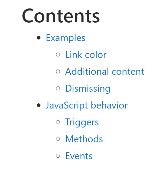
W3schools:Bootstrap alert tutorial

Bootstrap Alert Issue
